Your new front end best friends: ngrok and Safari mobile dev tools
TLDR: Inspect the browser of your mobile phone using Safari mobile dev tools, using only Safari and ngrok.
Three things have eluded humans since we gained consciousness, “Why are we here?”, “How did we get here?”, and “Why doesn’t it look the same on my phone as it does on my computer?”. I am here to help answer address the last one.

As a member of a startup working on the front-end, we only have so much time. I would love to handle all the edge cases, but at the moment, iPhone users are my concern.

But what about the other ~40%? Frankly, it is too fragmented to prioritize. Within that ~40%, you have multiple different vendors, screen sizes, and operating systems. For an MVP, you need to pick your fights.

Now that we see the reason to develop for iPhone, what browser? Answer: Safari.
But Joe, no one uses Safari.
Correction, everyone uses Safari; they don’t realize it.
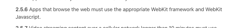
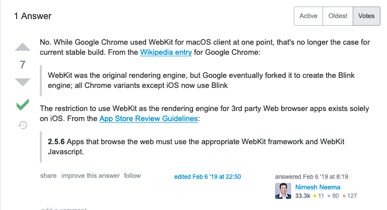
First, we need to understand that all browsers on iOS use the Safari WebKit rendering engine.
Second, we need to understand that the first time a user sees your site, it will most likely be via a message, email, or social media link. iOS doesn’t allow users to change the default browser to open the link. When you click the link, it opens the link using the default web browser - Safari.
Third, current dev tools and responsive design tools only get you so far. I know that I will find some issues after I push to production even if I tried my best to break it on my machine.
What to do?
- Turn on Web Inspector for Safari Mobile:
https://appletoolbox.com/use-web-inspector-debug-mobile-safari/ - **Plug iPhone into the computer to tell it to trust it ** “Connect via network”
- Download ngrok
https://ngrok.com/ - Fire-up your local server
yarn run start-dev - Fire-up ngrok
https://ngrok.com/docs#getting-started-expose - Send the ngrok URL to your device
- Open the link on your device
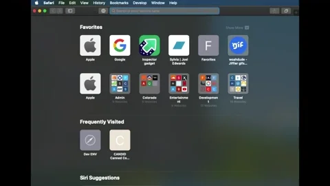
- Open Safari Mobile DevTools on your computer
`Develop > [Device Name] > browser title`
Now we have our local machine (localhost) being served via a publicly accessible URL and have dev tools open on our computer.
No more guessing and figure out where things are breaking. Simply select the page element and watch it highlight on your device.
:: Check out the gif and video examples below! ::
The examples are overlaying a screen recording of my computer and my mobile device synced in real-time.